You are using an out of date browser. It may not display this or other websites correctly.
You should upgrade or use an alternative browser.
You should upgrade or use an alternative browser.
Studio Series discussion
- Thread starter Paladin
- Start date
Well that Livestream kinda sucked.

Latest News and Updates!
Your one stop shop for Transformers News, Games and Comics!
 www.allspark.com
From the Front Page!
I liked it. I love hearing the design team talk about the products.Well that Livestream kinda sucked.
I kind of like this set, but I already have the Kingdom set. Blaster looks better here, but I don't mind his other version that much. Eject, if you look at the boxart, is a lot darker in the boxart than he is in the pictures. I prefer the darker look, so I will just wait until I see this set at Target to decide if I want to get it.
I'd probably be more willing to get this if I thought there was an easy way to get a proper Rewind.
I literally just got the kingdom version from the liquidation store. It's perfectly scaled for the ark to use it as a ghetto blaster.
Ark vs. Nemesis Dance Battle!
This version looks so much better, other than the head. I dont like that white.
Eject looks a lot better, but it would have been nice to see Rewind while they are recoloring.
Eject looks a lot better, but it would have been nice to see Rewind while they are recoloring.
When nemesis loses: he just breaks out gun shockwave, shoots ark, and steals blaster.Ark vs. Nemesis Dance Battle!
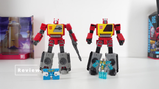
Here is a good side by side look at them:

I like the headsculpt on the SS86 one better. The lack of the painted section on his shoulders looks better, and I like the tape door better. Is that enough to get me to get one?

That blue just doesn't look as good as the darker blue in the boxart.
I like the headsculpt on the SS86 one better. The lack of the painted section on his shoulders looks better, and I like the tape door better. Is that enough to get me to get one?
That blue just doesn't look as good as the darker blue in the boxart.
Attachments
Yeah, I prefer the new Blaster, but not nearly enough to rebuy.
I never saw the first one, so I might grab the new one.
The boxart almost always has better colors than whats on the toy. I know in the past there have been toys with better paint apps and decos in the boxart than what actually made it to the toy. Frustrating to see what could have been with just something like the knees and hips having a splash of color added.
The sculpt is the same.I like the headsculpt on the SS86 one better.
Blaster feels to me like a slap in the face to fans. At least with SS 86 Rumble and Frenzy, we got a new mold and they were separately available.


The sculpt is the same.
The paint apps then genius. I like the way the new one's face and head look compared to the first released.
The boxart almost always has better colors than whats on the toy. I know in the past there have been toys with better paint apps and decos in the boxart than what actually made it to the toy. Frustrating to see what could have been with just something like the knees and hips having a splash of color added.
Look at the boxart on the back, where it shows the actual toy:
That blue looks a whole lot darker, and the gold and symbol pop better.

