What am I missing? How is this incorrect?
I'm genuinely curious, I'm not super clued into SG.
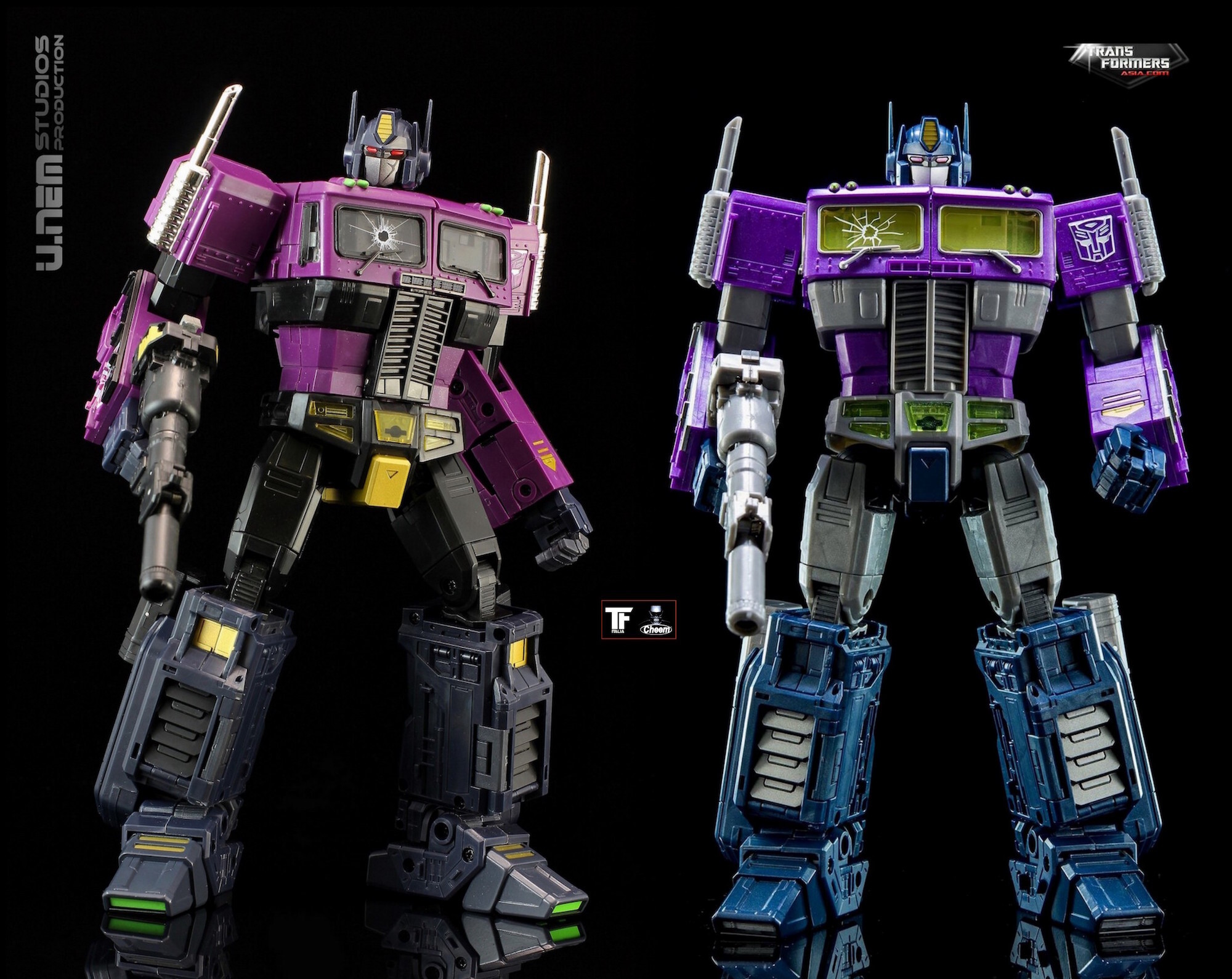
Parts that are grey (his rib stripes, hips/thighs) were originally black, and the blue parts (hands/lower legs) was originally more a dark slate blue, almost grey.
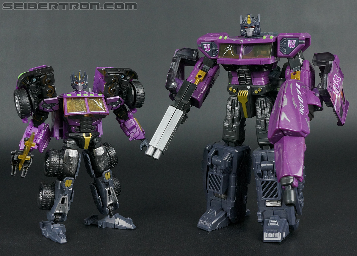
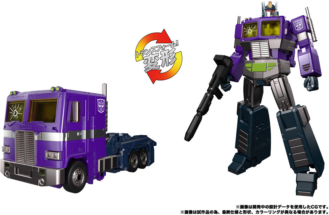
I suspect part of the problem is that the picture on the wiki of the original toy makes the blue look brighter (and the silver Stege detail on the black thighs just gets misinterpreted as being all silver). The TFU.info picture and the picture of the RtS G2 version are better representations.