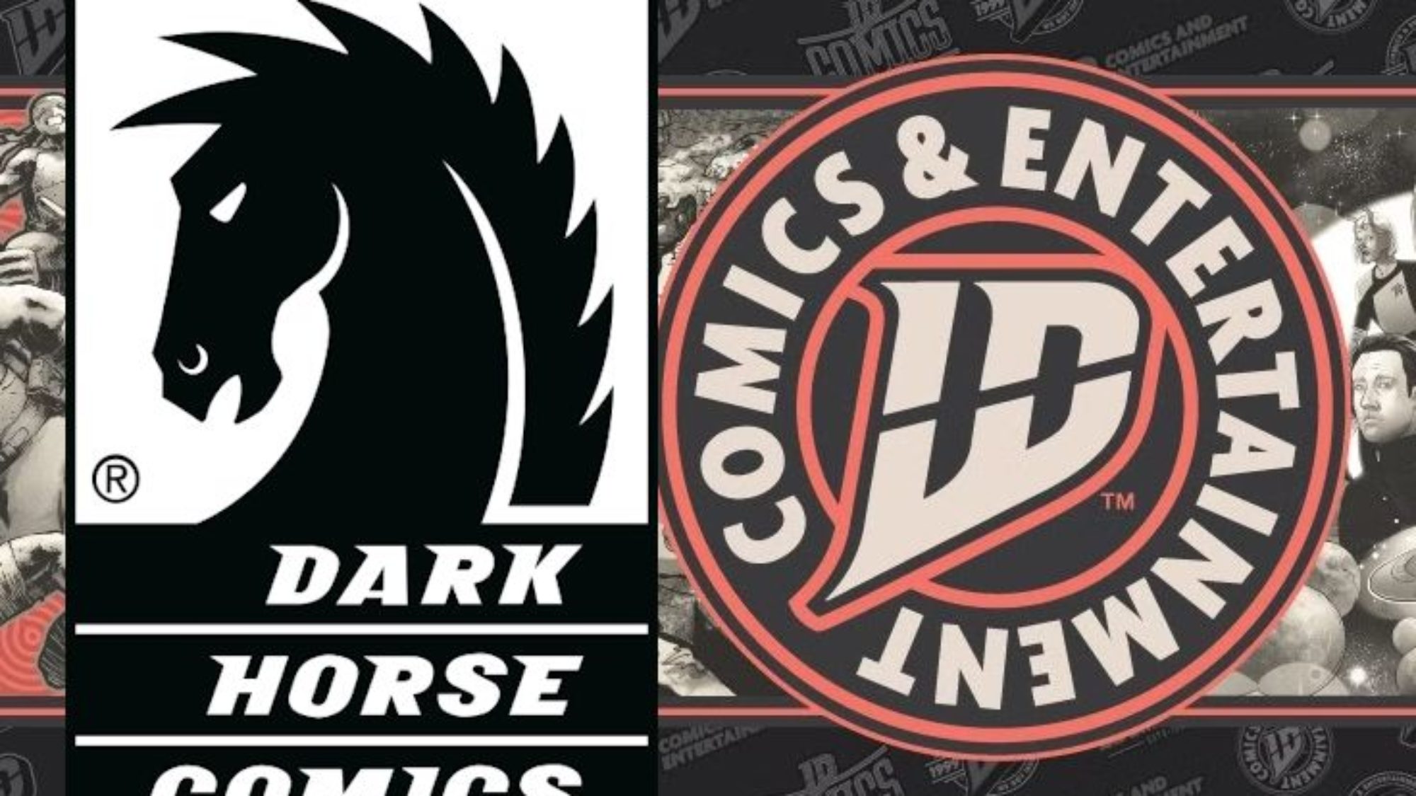
So, time for some good news and some bad news!
The "good" news is that IDW is getting a new logo! They're trying to rebrand. This shows they're putting in some effort! Good for them!
 majorspoilers.com
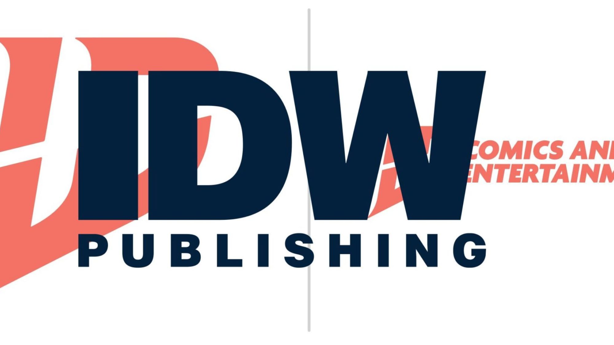
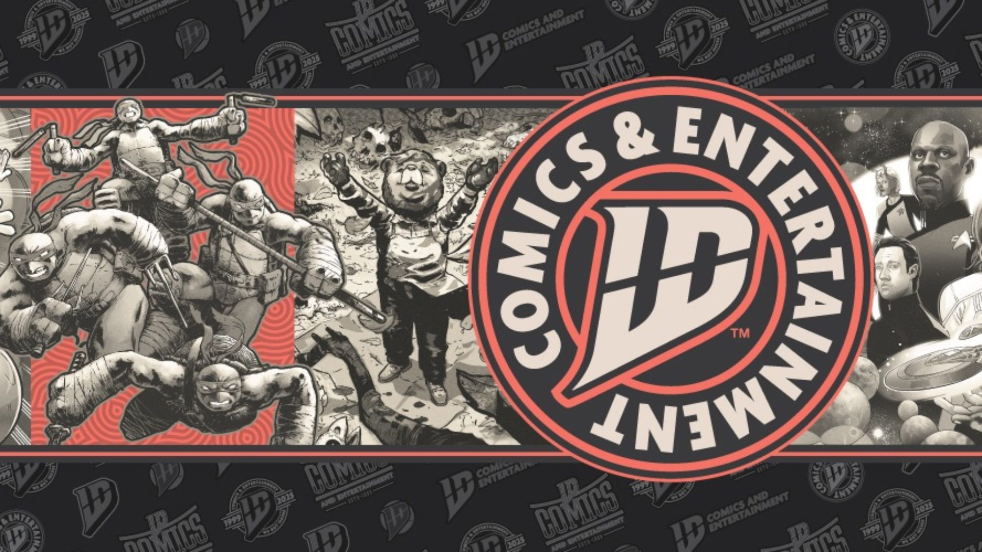
The bad news is, this is the new logo:

...And everyone and their mother seems to HATE it.

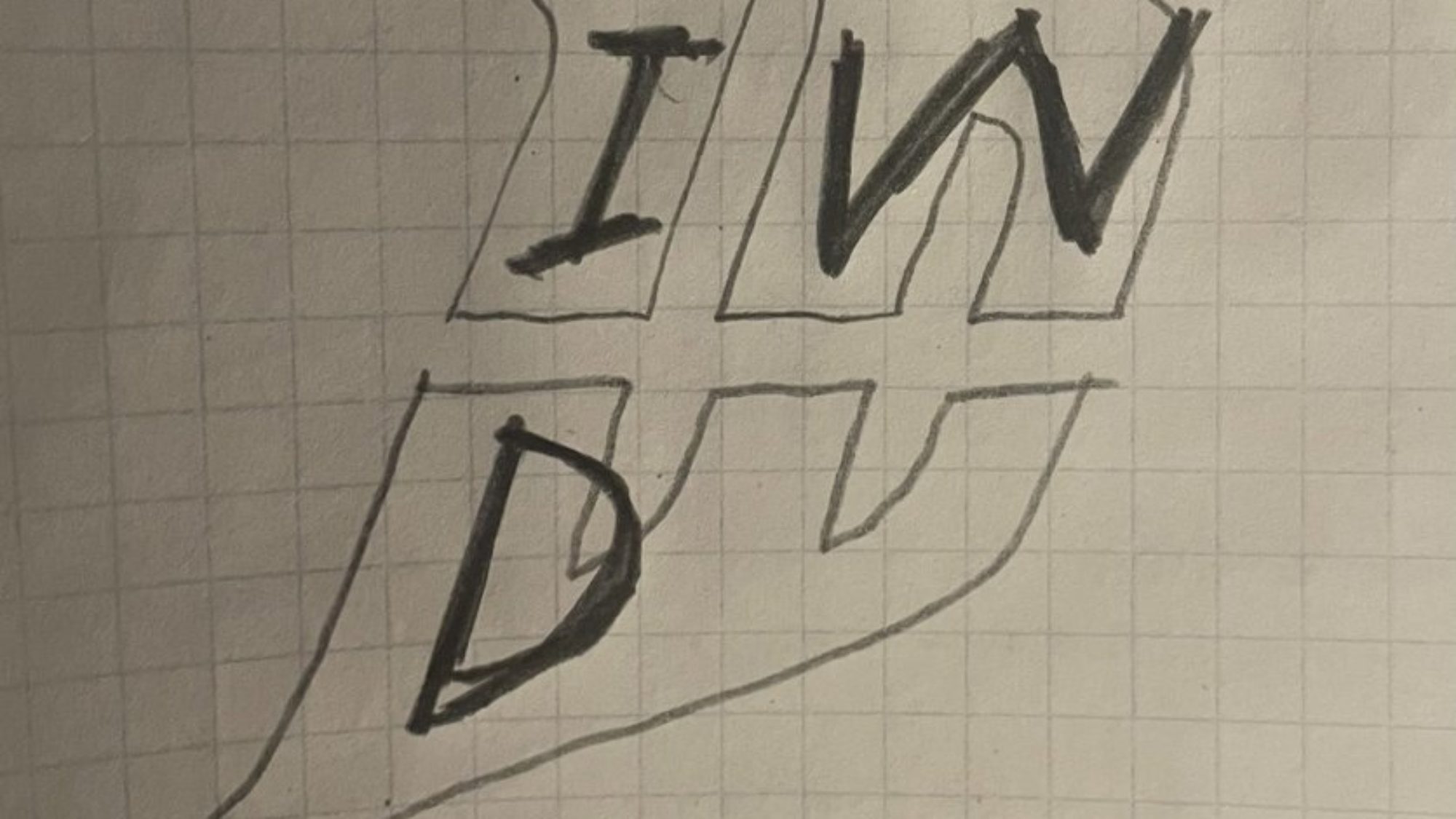
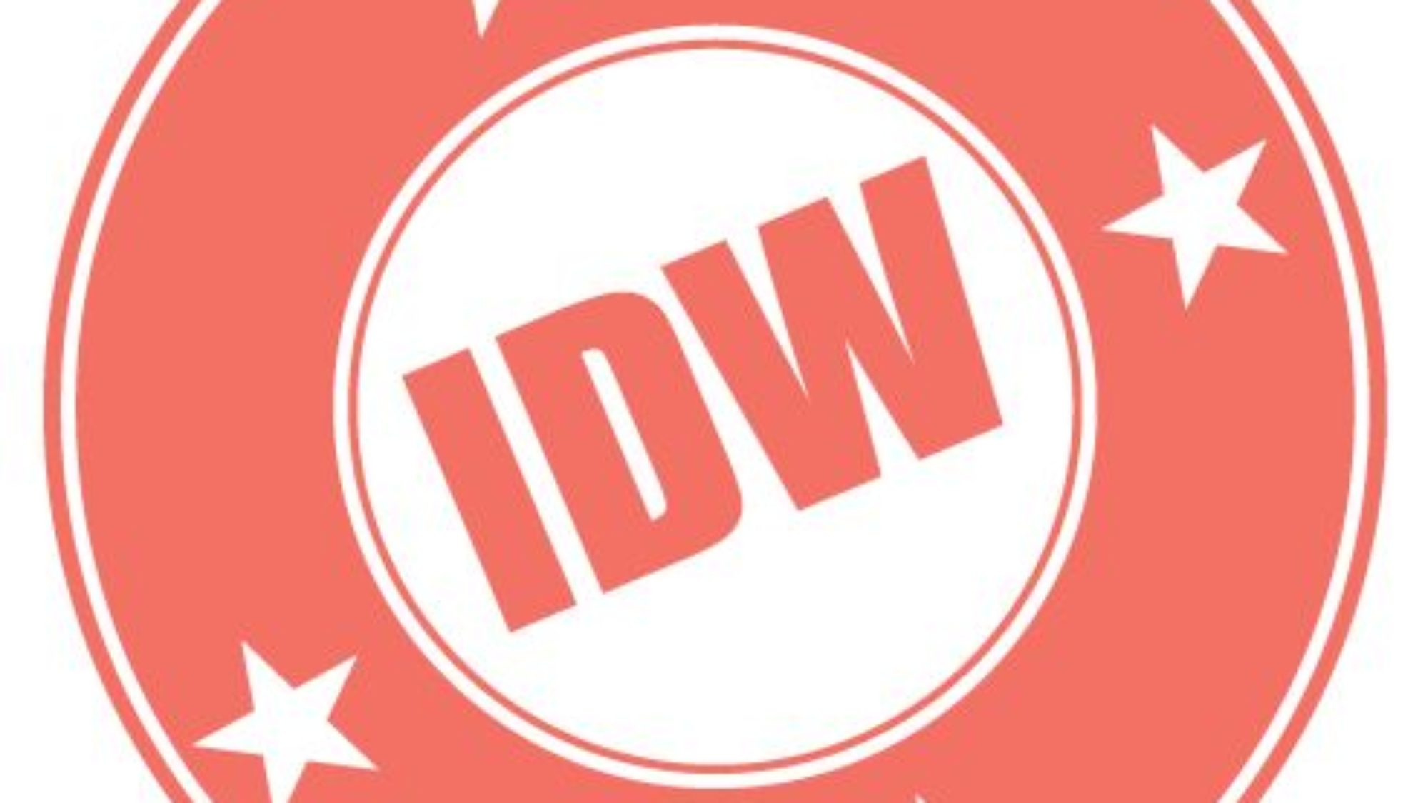 ...Even the person who designed the new logo seems to be making fun of it.
My two cents? Yeah...it's not great. It's a little over-designed. It's trying to be a little too clever. And it's not very "readable" just at a glance. it looks like it's "ID" not "IDW". It reminds me somewhat of the DC "page turn" logo from a few years back. Everyone hated that one, too.
I just have to wonder...how much money did IDW spend on this new logo? Because marketing teams don't come cheap. IDW's been having problems for a while now and THIS is what they choose to spend their money on? A new logo isn't going to fix their problems.
On the bright side...at least this got people talking about IDW again. Not in a good way, but, hey...free marketing! (Which they'll probably need after wasting all that money on a logo no one even likes...)
The "good" news is that IDW is getting a new logo! They're trying to rebrand. This shows they're putting in some effort! Good for them!
IDW Publishing drops new company logo — Major Spoilers — Comic Book Reviews, News, Previews, and Podcasts
As IDW Publishing begins its second 25 years, it has revealed a new logo for the company.
 majorspoilers.com
The bad news is, this is the new logo:

...And everyone and their mother seems to HATE it.

IDW Debuts A Very Stupid New Logo For Their 26th Anniversary, At NYCC
IDW Debuts A Very Stupid New Logo For Their 26th Anniversary, At NYCC... I mean seriously, is that LD, ID or INW? Definitely not IDW...
bleedingcool.com

Comics Industry Tells IDW To Change Their Stupid New Logo
Consider this an intervention, for IDW Publishing over their new logo, announced yesterday to almost universal disdain.
bleedingcool.com

Even IDW Logo Designer Nathan Widick Is Now Clowning On His Design
Even IDW Logo Designer Nathan Widick is now clowning on his own logo design, after the comic industry showed their issues with it.
bleedingcool.com
My two cents? Yeah...it's not great. It's a little over-designed. It's trying to be a little too clever. And it's not very "readable" just at a glance. it looks like it's "ID" not "IDW". It reminds me somewhat of the DC "page turn" logo from a few years back. Everyone hated that one, too.
I just have to wonder...how much money did IDW spend on this new logo? Because marketing teams don't come cheap. IDW's been having problems for a while now and THIS is what they choose to spend their money on? A new logo isn't going to fix their problems.
On the bright side...at least this got people talking about IDW again. Not in a good way, but, hey...free marketing! (Which they'll probably need after wasting all that money on a logo no one even likes...)


